Video Game Nostalgia
I was inspired to create this blog post when I discovered freeCodeCamp’s YouTube video regarding using CSS to create 8-bit characters.
Choose Your Character
First and foremost, we need to select a character to use in this tutorial. Choose a character you want to bring to life with CSS by googling any 8-bit character that you fancy.
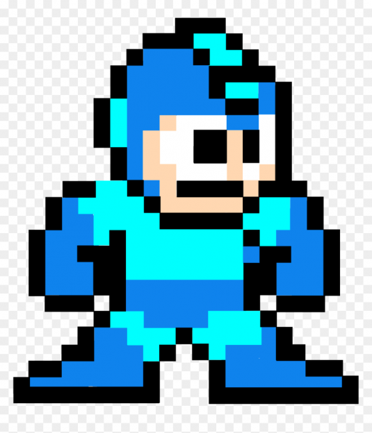
For this example, I have chosen to emulate Megaman.
Character Setup
We need to set up the HTML environment where the 8-bit character will be housed in before we get started with any type of CSS work.
First, create the parent <div> container and assign a class to the div called, parent_{character}_container
Next, create a child <div> container inside the parent_{character}_container and assign a class to the div called, child_{character}_container
Replace the {character} snippet with what your character is.
Your final HTML should resemble this:
<div class="parent_megaman_container">
    <div class="child_megaman_container"></div>
</div>
Creating The Character In CSS
Now that we have our chosen character and HTML environment set up, it is time to focus our attention on CSS.
Apply this CSS to the parent container:
.parent-megaman-container {
    display: block;
    height: 26em;
    position: relative;
    width: 23em;
}
We are using EMs instead of PXs because the numbered coordinates are a lot easier to process in EMs instead of PXs, which you will soon see why in a minute.
The width and height values are based on the rows and columns of your 8-bit photo. Adjust those values accordingly.
Apply this CSS to the child container:
.child-megaman-character {
    background-color: transparent;
    display: block;
    width: 1em;
    height: 1em;
}
And now for the CSS style that creates the 8-bit character: box-shadow.
The three parameters that are going to make up the 8-bit character are the x-coordinate ( known as the horizontal offset ), y-coordinate ( known as the vertical offset ), and color.
Let’s start off with the first row as an easy example. The first row in the Megaman picture consists of nothing but white squares.
With that being said, the first row is going to look like this:
.child-megaman-character {
    background-color: #ffffff;
    display: block;
    height: 1em;
    width: 1em;
    box-shadow:
        0em 0em #ffffff,
        1em 0em #ffffff,
        2em 0em #ffffff,
        3em 0em #ffffff,
        4em 0em #ffffff,
        5em 0em #ffffff,
        6em 0em #ffffff,
        7em 0em #ffffff,
        8em 0em #ffffff,
        9em 0em #ffffff,
        10em 0em #ffffff,
        11em 0em #ffffff,
        12em 0em #ffffff,
        13em 0em #ffffff,
        14em 0em #ffffff,
        15em 0em #ffffff,
        16em 0em #ffffff,
        17em 0em #ffffff,
        18em 0em #ffffff,
        19em 0em #ffffff,
        20em 0em #ffffff,
        21em 0em #ffffff;
        22em 0em #ffffff;
}
Continue applying the same method for all the other rows and columns until you have completed the 8-bit picture. Yes, you will have a very long box-shadow style.
The Final Result
Depending on what your background preference is, you can set the background-color and empty cell colors to transparent.
Here is the final product of creating an 8-bit picture using the box-shadow CSS.
Here is the final product of creating an 8-bit picture using the box-shadow CSS with the transparent twist.
And That’s It, You’re Done!
There are tremendous amounts of 8-bit characters to choose from. The choice is yours.
Try out a couple of different characters to get the hang of the box-shadow style, but more importantly remember to have fun with this tutorial. Be creative and construct your own 8-bit character.
I hope you were able to learn something new! If you would like to know more about a certain web-development topic and want me to do a tutorial about it, shoot me a message and let’s make it happen.


